the transformation of our nest…
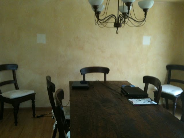
i’m sure you are all wondering what our nest looks like! we’ve been working on it over the last year and still have a few final touches. we mostly wanted to remodel the very small dated kitchen but, as most remodel projects unfold…it extended into a few surrounding rooms. we have a quintessential california ranch house that strangely has grown on me. when we lived in oregon and we were going to buy a house, we looked at the ranch style homes and we really didn’t like them, our realtor called them “ranch burgers”. but the ranches in our neck of the woods are tastefully redone with a nice airy style similar to what you see in the pottery barn catalogs. first, i’m going to post the remodel of our dining room. here are some before photos…
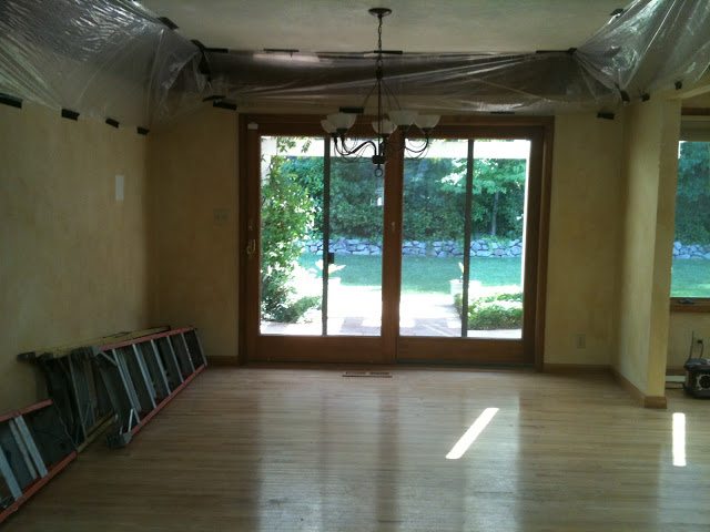
i believe the original owners painted the walls in a faux italian finish. it wasn’t done correctly and my mother-in-law thought that we had water problems that ruined the walls! anyway, i really wanted to paint over the finish, but had to suffer with it for a year since we were going to eventually do a major remodel. the two white spots in the dining room were a mystery to us since it was left there by the previous owners…hmm…and ideas anyone?
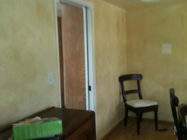
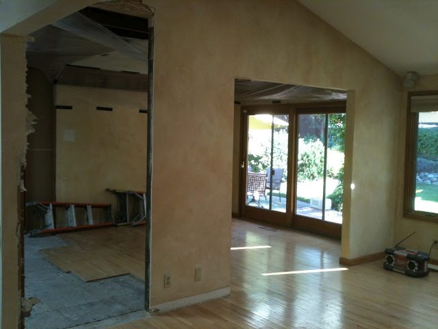
the doorway in the photo was the thru way to the kitchen. the original dining room was dark and had a very enclosed feeling so, of course i wanted to install sky lights in this room. we nixed the idea since it was too expensive. a little secret about me….i have a difficult time staying on budget!
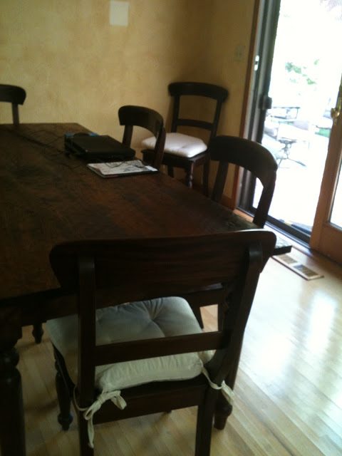
you can kind of tell in this photo that the floors were buckling due to moisture in the crawl space below. we had to insulate the whole crawl space and install fans to push the moisture out. we ended up refinishing the floors and restaining them a darker color.
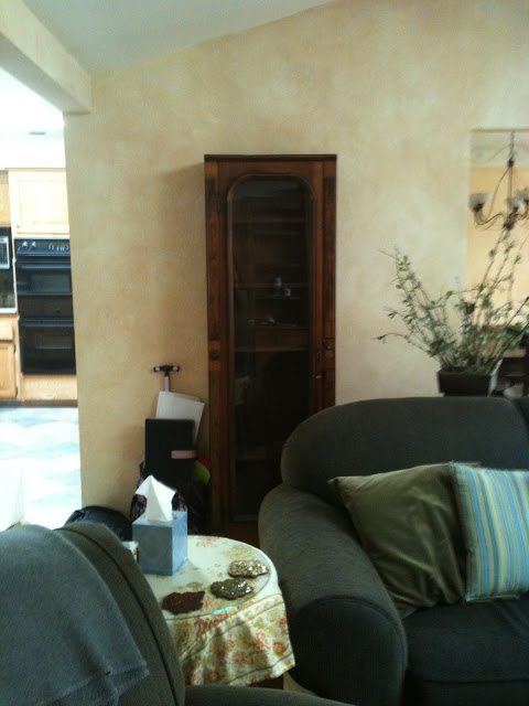
old view of the dining room from the living room
the old dining room had soffets that enclosed the ceiling and made the room feel lower. we had them removed. we just love the sliding glass door to the backyard. we had the door painted white, which now contributes to a brighter look in the room.
in the photo, the area to the left was a wall that was taken out. we had planned to reinstall a new wall back in with a bigger entrance between the dining room and kitchen. once the wall was removed in the demolition stage, my husband and i loved the openness! we asked our contractor if we could leave the wall out and he said that would work since it wasn’t a bearing wall. unfortunately, we had designed cabinets for that wall, so we quickly found a home for them in the dining room. whew… looking at these photos, reminds me how crazy our lives were for 7 months!
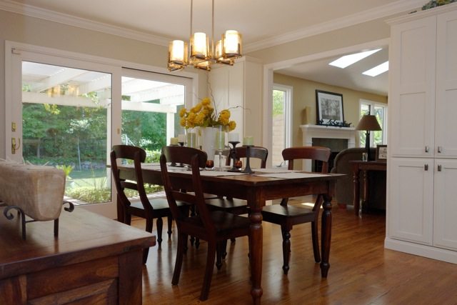
here is our new dining room! i just love the space and since we opened it up to the kitchen, the room now gets a lot more light. i love my extra cabinets and i’m surprised how they look like they were always designed for those two locations!
Latest posts by Janine Waite (see all)
- Simple Pasta Sauce Recipe - May 7, 2026
- Fried Wonton Recipe (Pork) - May 1, 2026
- Onion Ring Pizza Recipe - April 24, 2026



Debbie
Hey Janine..Just checked out your photos!!! So interesting..Looks like you made some great decisions (and Mike!). I love the openness, too…The slider door looks great…Allan and I just bought a log cabin in Lake George, and we are playing arond with decorating and having a blast…I'll send you more pictures..Oh..if it is still up, you can look at the old real estate listing..56 Dream Lake Road, Lake George, NY..
Anonymous
Susan said, wow Janine! You guys did an awesome job! It's beautiful!
happyhappynester
Thanks so much!
Janine Waite
Hi Debbie,
Thanks so much for your kind comments! It was an amazing change and I'm glad we did it. We now enjoy the space in all the rooms since the flow is more open. That is exciting about your cabin, I'll try and find it on the web. Have fun enjoying it, that is Michael's dream! Thanks so much for visiting! Janine
Janine Waite
Hi Susan,
Hooray, you were able to post a comment! I did something right with the settings! Janine